.png)
Forms
Overview
The Forms section in Onboard+ allows users to create, configure, and manage forms used throughout the onboarding process. Forms are fully customizable and support a wide range of field types, configuration options, and validation rules.
Using the Form Builder, users can design forms through a drag-and-drop interface, configure field behavior, define required documents, and add custom actions. Forms can be previewed before saving to ensure accuracy and usability.
Screenshot: Form Grid
Accessing the Forms Section
The Forms section is available within the Onboard+ module. This area displays all existing forms and provides access to create new forms or manage existing ones.
The main Forms page serves as the central hub for viewing and maintaining all forms in the system.
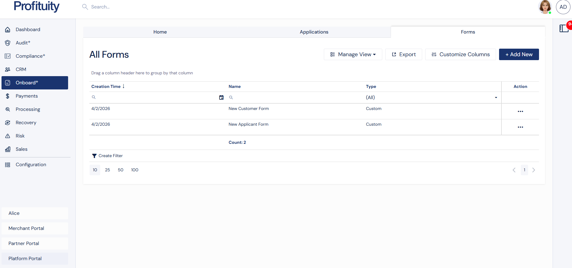
Forms Grid Page
The Forms grid displays all available forms. This view allows users to quickly review, search, and manage forms.
Each form entry includes key details such as name, type, and creation date.
Available Actions
From the Forms list, users can perform the following actions:
Add New – Create a new form
View – Open a read-only view of the form
Edit – Modify an existing form
Clone – Create a copy of an existing form
Delete – Remove a form
Invite – Use the form in an onboarding workflow
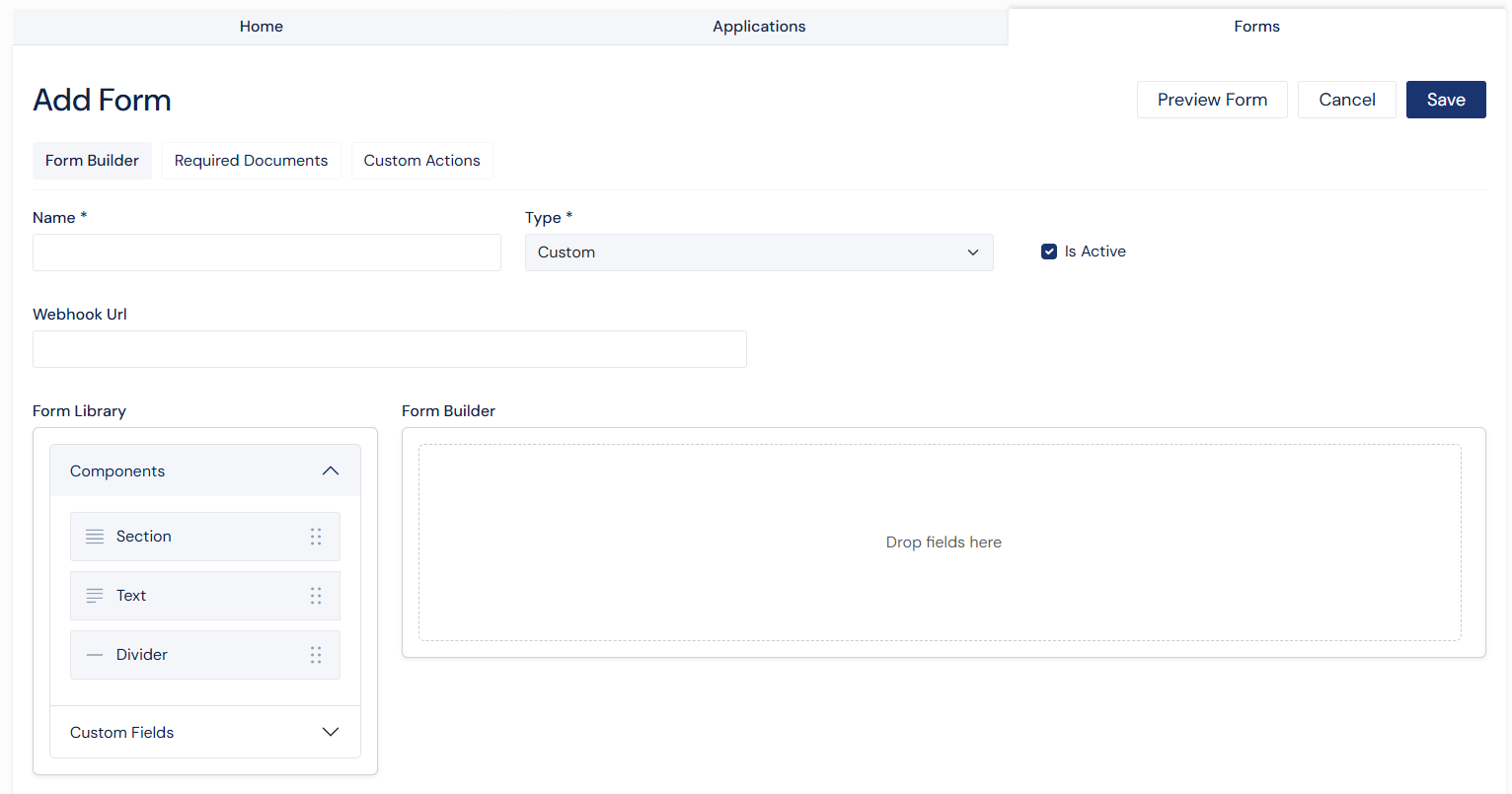
Creating a Form
To create a new form, select Add New from the Forms list page or clone an existing form.
Users can define basic form details and then build the form using the Form Builder.
Basic Information
When creating a form, users can configure:
Form Name
Form Type
Active Status
Webhook URL (optional)
Building the Form
After entering basic information, users build the form using the Form Builder tab. Additional tabs allow configuration of required documents and custom actions.
Before saving, users can preview the form to verify its structure and behavior.
Screenshot: Form Creation Page
Editing a Form
Existing forms can be updated from the Edit page. Users can modify the form structure, update field configurations, manage documents, and adjust custom actions.
All changes can be previewed before saving to ensure accuracy.
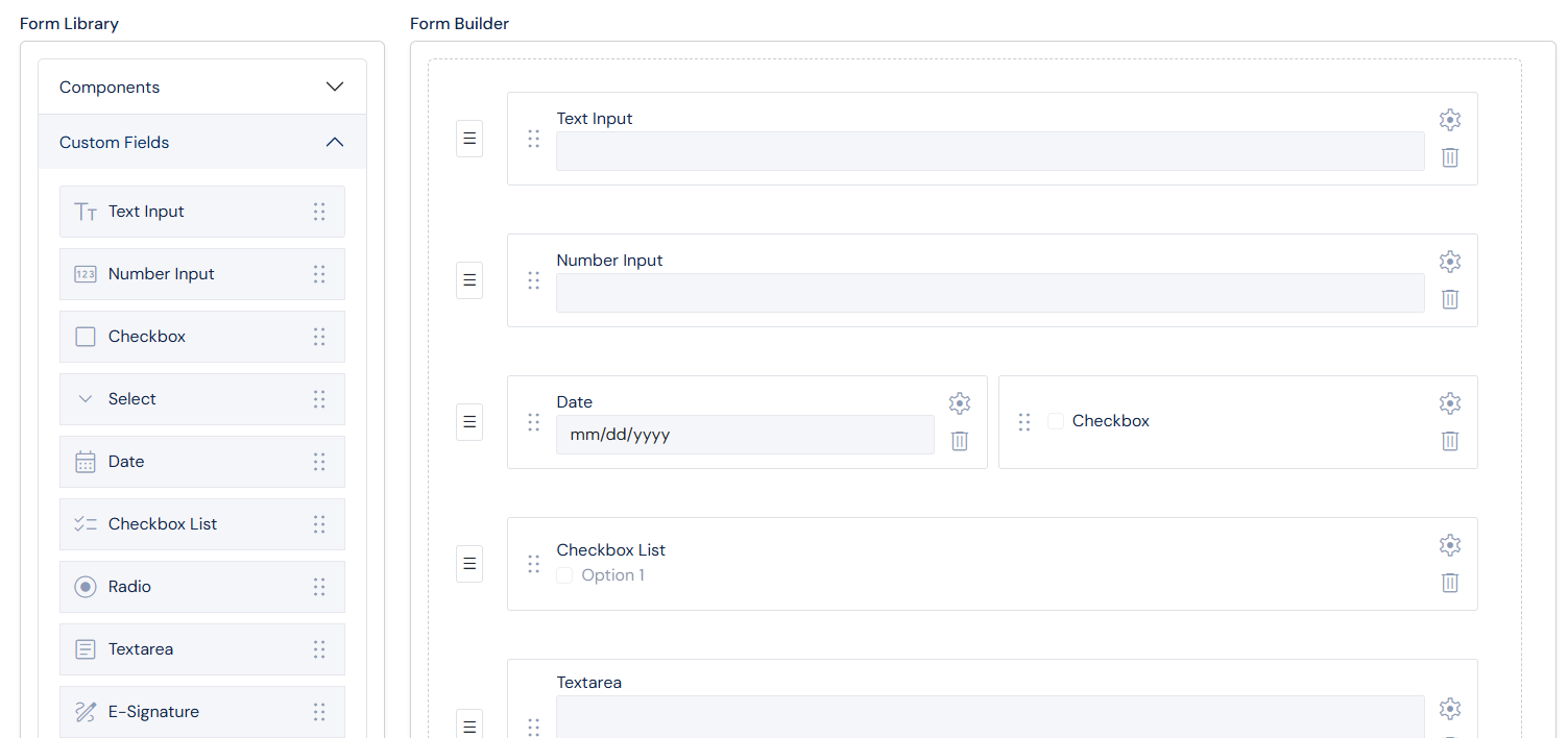
Form Builder
Overview
The Form Builder is the core tool used to design forms. It provides a drag-and-drop interface that allows users to add, arrange, and configure fields.
Screenshot: Form Builder
Layout
The Form Builder consists of two main areas:
Form Library
Located on the left side, the Form Library contains all available components that can be added to the form.
Components
Section
Text
Divider
Custom Fields
Text Input
Number Input
Checkbox
Select
Date
Checkbox List
Radio
Textarea
E-Signature
Consent for E-Signature
Hidden Field
Builder Canvas
The builder canvas is the main workspace where fields are placed. Users drag items from the Form Library into this area to construct the form layout.
Adding and Arranging Fields
Fields are added by dragging them into the builder canvas. Once added, fields can be repositioned to organize the layout.
Field Configuration
Each field can be customized using the configuration panel. This panel allows users to define how a field behaves, how it appears, and how it interacts with other fields.
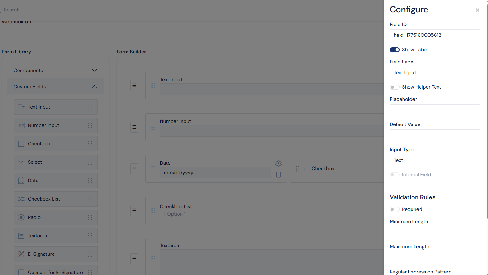
Screenshot: Configuration Panel for Text Field
Common Settings
Most fields support the following configuration options:
Field ID
Field Label
Show Label
Helper Text
Helper Text Position
Required setting
Conditional Logic
Internal Fields
Verified Sections
Helper Text
Helper text provides additional context for users completing the form. It can be displayed:
Next to the label
Below the label
Below the field
Validation
Validation rules ensure that user input meets specific requirements.
Text fields can include:
Minimum and maximum length
Pattern validation (regular expressions)
Number fields can include:
Minimum and maximum values
Currency formatting
Decimal precision
Field Types
The Form Builder supports a variety of field types to accommodate different data collection needs.
Section
Sections are used to group related fields. They help organize the form into logical parts and improve readability.
Sections can also be configured as internal or verifiable.
Text Input
Text fields support multiple input formats, including email, URL, phone number, postal code, and routing number. These fields can include placeholders, default values, and validation rules.
Number Input
Number fields allow numeric input and support formatting options such as currency and decimal precision.
Checkbox
Checkbox fields allow users to select a single option. These fields can be required and optionally checked by default.
Select
Select fields provide a dropdown list of options. Users can define custom options or use predefined sets such as U.S. states.
Date
Date fields allow users to select a date. These fields support placeholders and default values.
Checkbox List
Checkbox list fields allow users to select multiple options. These fields support default selections and layout customization.
Radio
Radio fields allow users to select a single option from a list. A default value can be defined.
Textarea
Textarea fields provide a larger input area for longer responses.
E-Signature
E-Signature fields are used to capture a user’s electronic signature. These fields are typically required.
Consent for E-Signature
This field confirms the user’s agreement to use an electronic signature and is required for submission.
Hidden Field
Hidden fields store values that are not visible to the user. These are typically used for internal processing or data mapping.
Conditional Logic
Conditional logic allows fields to be displayed dynamically based on user input.
Conditions are based on other fields using their Field ID
Fields can be shown or hidden depending on selected values
Field relationships are maintained even if Field IDs are updated
This allows forms to adapt dynamically and display only relevant information to users.
Internal and Verifiable Sections
Internal Sections
Sections can be marked as internal. Fields within these sections are intended for internal use and are not displayed to external applicants. All fields within an internal section are required to be internal. Users can not mix internal fields with external fields in the same section.
Verifiable Sections
Sections can also be marked as verifiable. These sections include a verification indicator and are used during application review processes.
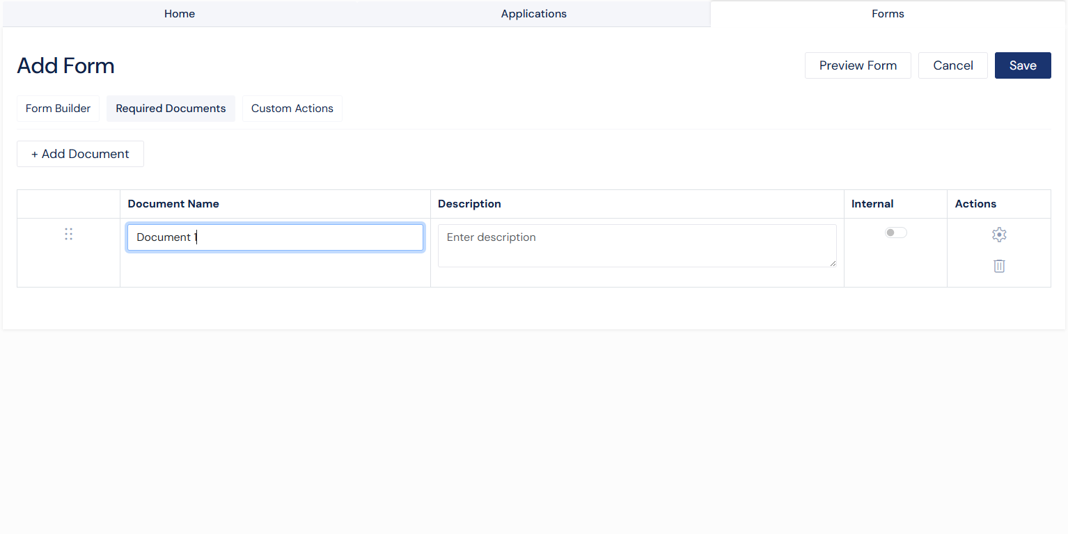
Required Documents
The Required Documents tab allows users to define documents that must be submitted along with the form.
Users can:
Add document requirements
Provide a document name and description
Mark documents as internal
Edit or remove documents
Conditionally require certain documents based on fields
Screenshot: Required Documents Tab
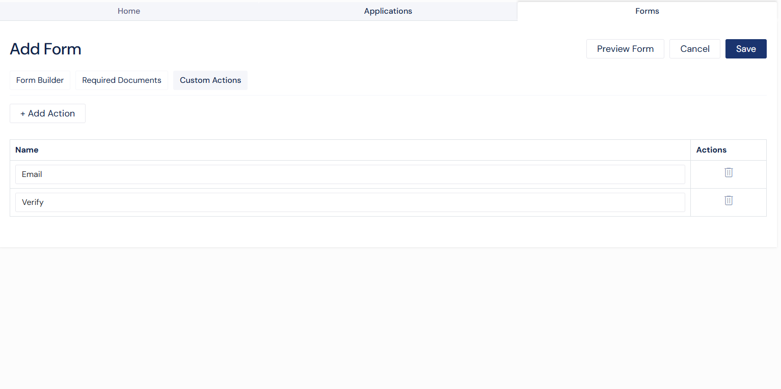
Custom Actions
The Custom Actions tab allows users to define additional actions associated with the form.
Users can:
Add custom actions
Define action names
Edit or remove actions
Screenshot: Custom Actions Tab
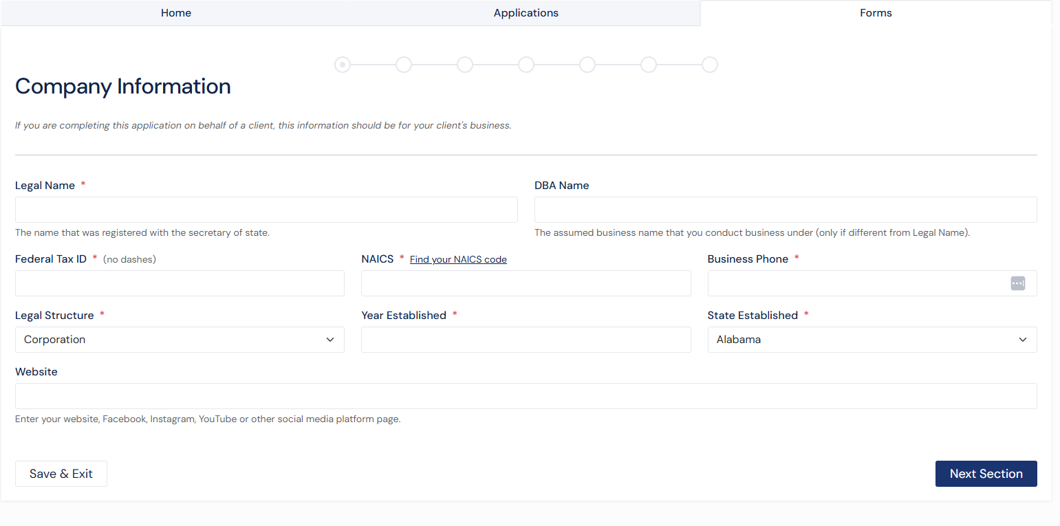
Previewing a Form
The Preview feature allows users to see how the form will appear to end users before saving.
This includes all configured fields, sections, and logic, ensuring the form behaves as expected.
Screenshot: Form Preview
Viewing a Form
The View page provides a read-only version of the form.
Users can review:
Form structure
Required documents
Custom actions
Available actions may include cloning, editing, inviting, or deleting the form.
Saving a Form
Forms can be saved from the Create or Edit page. Before saving, validation is performed to ensure all required configurations are complete.
Once saved, the form becomes available for use in onboarding workflows.
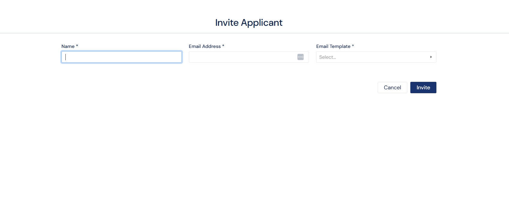
Inviting to a Form
Forms can be sent directly to applicants using the Invite feature. This allows users to initiate the onboarding process by sending a form to a specific individual.
To invite an applicant, select Invite from the available actions on a form from the grid or view form page. This will open a modal where the applicant’s details and communication settings can be entered.
Sending an Invite
In the Invite modal, users are required to provide:
Applicant Name
Email Address
Email Template
Once all required information is entered, select Invite to send the form to the applicant.
The applicant will receive an email with instructions to complete the form.
Screenshot: Invite Applicant Modal
Best Practices
Use clear and consistent Field IDs
Group related fields into sections
Provide helper text where needed
Limit required fields to essential inputs
Preview forms before saving
Keep internal-only content clearly separated